It is the mark of a true artist to create something unique and something that is original every time he is asked to deliver. Be it a piece of music, an article, a business card design, or a logo; if it’s not original, it won’t last. In the brisk world of business today, it has become synonymous with success to have a great attractive logo, which can help your brand to make its mark and get it identified in the minds of the people.
The purpose of having a logo is simple; to get noticed. It is evident from the enormity of this task that a logo requires tremendous amount of attention, it should be well thought out, thoroughly researched and acutely relevant to the brand that it is going to promote. The more work a company or a client puts in, the better chances they have of having a terrific logo. It is needless to say that the image that is going to carry the promotion of your product should be smart, artistic, original and unique. What to do then, if a client asks a designer to create a logo that looks similar to some other brand’s logo just because they want to play it safe? If a client wants to save himself from failure, overlooks the essential features of a logo design, and settles for the second best, what is a designer supposed to do?
• A Fine Line….And Slippery Too!
Art is all about inspiration. Be it a song you heard or a rainbow you saw, anything and everything under the sun can become the inspiration for your creativity. When a client comes to you and mentions some big brand logos, indicating their preference for the tried and tested, it is your duty as a creative person to gently guide them away from such troublesome waters. And you never know what starts as ‘just a hint of this and that” might lead up to a lawsuit and get you into big time trouble. Not to mention the fact that it shows a lack of artistic integrity when you rip off someone else’s work and pass it on as your own.
A similar design always gets noticed and is always looked down upon, for if your logo is not original, who is to say that, your product is? It is actually putting the integrity of your brand on the line, taking a huge risk when you try to imitate someone else’s already famous logo just so you won’t have to come up with your own, or even if it is because you really like their style, you are not being fair to your client. If the client wants their logo to be an imitated version of some other company, it is bad; but if a designer does it on his own, it’s worse! An artist is always true to his heart, and that heart never allows him to ‘borrow” someone else’s hard work for his own purposes. Imitation has got nothing to do with inspiration; in fact it shows an abundant lack of it.
• What Real Creatives Say?
When I decided to write on the subject, I wanted to know what real professionals thought about it and I received fantastic responses from designers as well as a people coming from different walks of life; people who understandand believe in the importance of free imagination and ingenuity. On a LinkedIn thread, we discussed how in reality we create nothing and merely plagiarize nature. Similarly, in logo design, the best we can do is to expect our work to be distinctive and doing justice to the brand. If it is clean, simple, and unique; it will be remembered by the customers world over. If it looks trite, it is doomed to fade away quickly. Read some of the responses we got and feel free to join the conversation there:

“This doesn’t really answer your question, but here’s a story from my personal experience:
I recently had someone contact me wanting a logo. They had seen one in my portfolio on my website and wanted one just like it, just change the name. I told them that logo was owned by my current client and I could not duplicate it, but we could come up with some different that was original for them. They got mad at me and never went through with doing business with me. I could not believe that a business owner would want to rip off a logo like that!“
“As Picasso said: “Good artists copy but great artists steal”.
I had to sign a disclaimer once, because I not only deliberately copied an ‘iconic’ image, but insisted on make it as close to the original as possible without it actually being identical, rather than some watered down version that had been ‘influenced’ by it.
Ironically, the client was more worried about the hand-lettered typestyle which they considered was the original artist’s trademark… so I downloaded the (free) font based on his lettering and (begrudgingly) used that, with a few tweaks.
I even went as far as contacting the (deceased) artist’s website to ask if they considered it a ‘tribute’ or a ‘rip-off’. They gave it the green light; I gave him a credit, and nothing untoward happened.
On the other hand, I did come down hard on a fashion store that was selling t-shirts using an ancient design I was involved with from 25 years previously. Funnily enough, they had actually used the handwriting from the original and made new words from the letters. Blimmin’ cheek!“
Join conversation on LinkedIn.
• Focus on Originality:
Originality is a valuable asset when it comes to designing a logo. Because people are innately attracted to a new, fresh and unique look, and if it resembles some other brand, or reminds them of any other company, then the purpose of your logo is finished.
 “The line is drawn at the point where someone in the meeting says ‘I think we should change {xxx} so that it doesn’t look too much like {rivals} logo’. If the phrase ‘Attorney’ is mentioned at the same meeting, you’re already over the line…
Only the artist can determine where the line is; but if there’s any possibility of confusion, then your pushing it. Convince the client that they have some unique property or service that you want to aim towards, and direct them away from a copy.”
If your logo cannot make you stand out, make you memorable, then what’s the point of going through all the trouble? It is imperative to check the impulse when it takes you beyond the point of admiring someone’s work to actually wanting it presented as yours.
 “What is crucial is to take a step back and try to understand why something works, what makes this design so good and how we can achieve the same efficiency without copying the outcome. Easier said than done, though.”
There are many brands that have copied or borrowed the designs and fonts and typefaces of other brands, but if it serves your purpose, does it mean that it is all right? It’s not necessary that copying a logo will result in your failure, but it remains unethical, immoral, and illegal.Why would a company sabotage the reputation of its product by imitating a famous design? But that is what happens all around the world.
“Status quo is the way to go. Give them what they can relate to. What they have been conditioned to accept.”
There are countless examples of similar, in some cases, identical logos and they may not have hindered their product’s success, but they do not project a good impression when you analyze them.
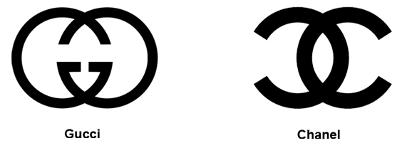
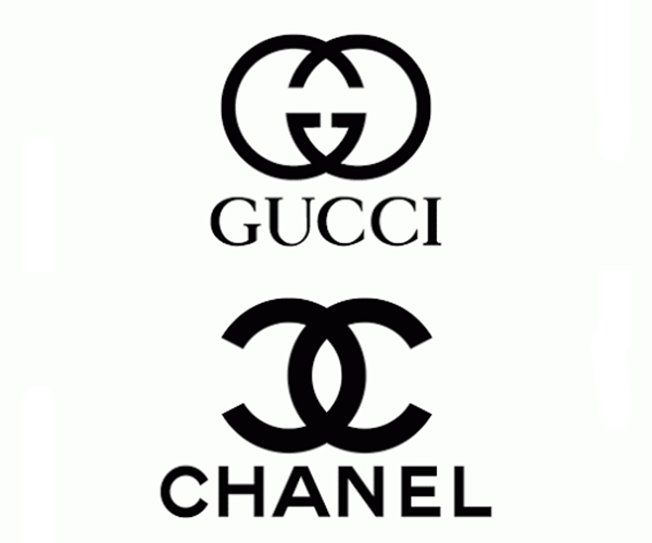
• Gucci and Chanel: Who would have thought that such famous brands couldn’t come up with original designs, and maybe they did, but the designs look remarkably same.
• CARRIER and FORD: Both these brands have lookalike logos, from color and shape to font and size.

• SUN Microsystems and COLUMBIA SPORTSWEAR:These two logos are also identical, with just the change in their color. Even though the SUN Microsystems logo is clearly the better known one, it didn’t escape from being copied.

• AMETEK and AXIS BANK: Again it can be seen as the same logo, flipped to appear different, but does it?

• Refuse To Take Anything But The Best & You Might Just Get It!
On the other hand, the truly original designs have stood the test of time and are still holding their own among the competition that crops up every day. They have not only nailed the essence of their product, but made such a niche for themselves that nobody can even consider ripping off from them. For example:
• TARGET: The Target logo has been around for half a century and is still intact. It delivers a clear impression of its name, what its company entails, and is a timeless classic.

• APPLE: The Apple’s iconic logo is one of the best logos in the industry. Its simple style is unique and it too has stood the test of time.
• SHELL: The Shell image is once again, the best known around the globe. There aren’t many details in it, yet it conveys the product simply and clearly.

• UNILEVER: The Unilever logo contains the logos of all the products that it produces. It is comprehensive and compact at the same time. Another classic example of an all-time best design.
• Trapped by Imitation, Freed by Imagination:
The world is full of ideas, and using a unique one to create a logo is what the game is all about. Maybe it is true what everybody says, maybe the similarity in ideas can happen because we are all inspired by the same objects, but to strive to be different, better and fresher than others is what makes you and your work stand out. If your client wants you to imitate someone else’s work, you need to convince him that whatever you are going to create is going to be better, because it won’t be stolen from someone else. As a designer, it is your task to convince and to deliver rare and original pieces of work.
There should be a reason for your clients to keep coming back to you, and let that reason be your originality. As Mike Davidson says:
“Tell yourself at every step in the design process that someone has undoubtedly already thought of this and what can you do to really set it apart. In design, and particularly logo design, the pessimistic axiom that ‘everything has already been done’ is becoming more and more true, and it is only the virtuous designer who can continue to stand out in a sea of sameness.”



While the Apple logo may stand the test of time, it hasn’t done so without a few bumps along the way.